Niche products for addressing specific tasks

Vehicle leasing software
Vehicle location tracking for car loans, vehicle leasing, and finance industry

Agriculture fleet tracking
Control crops rotation and field works with Hecterra

Delivery fleet management
We developed Logistics service for you to manage delivery operations

Driver behavior monitoring
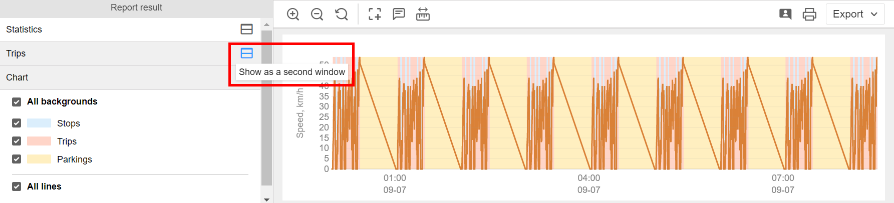
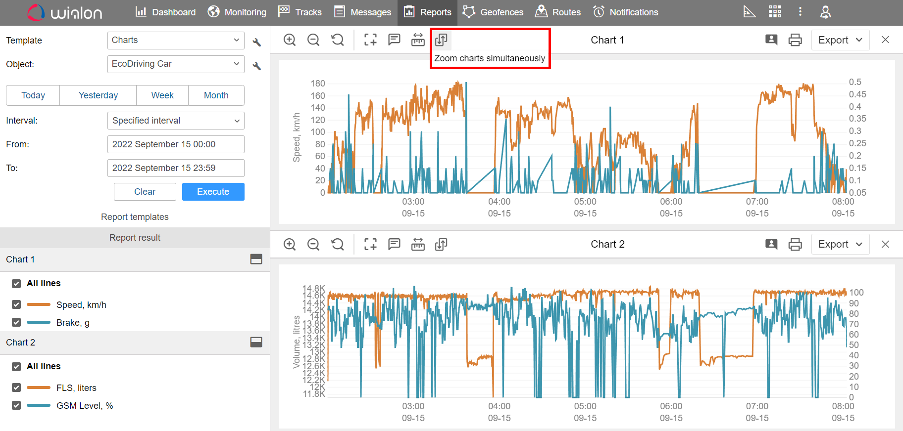
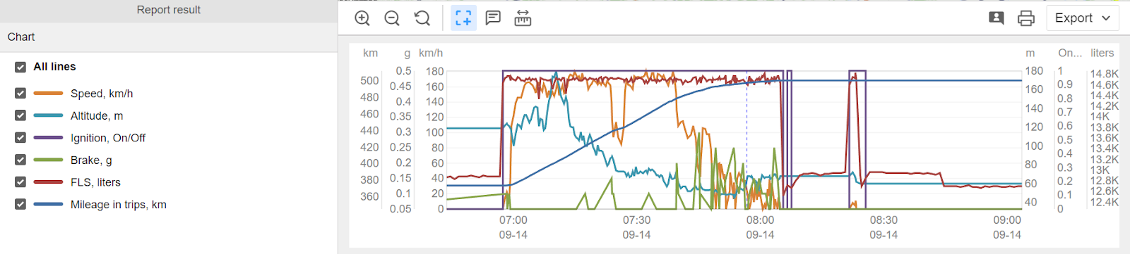
Eco Driving – the solution to monitor driving quality

Fleet maintenance management
The web application to plan, control, and record expenditures for maintenance

Field employee tracking
WiaTag turns a smartphone into a GPS tracker and allows controlling field operations and mobile staff performance

Public transportation management
NimBus is designed to control fixed routes vehicles

Fuel monitoring system
The module is designed to calculate fuel consumption in any type of machinery, from vehicles to filler trucks